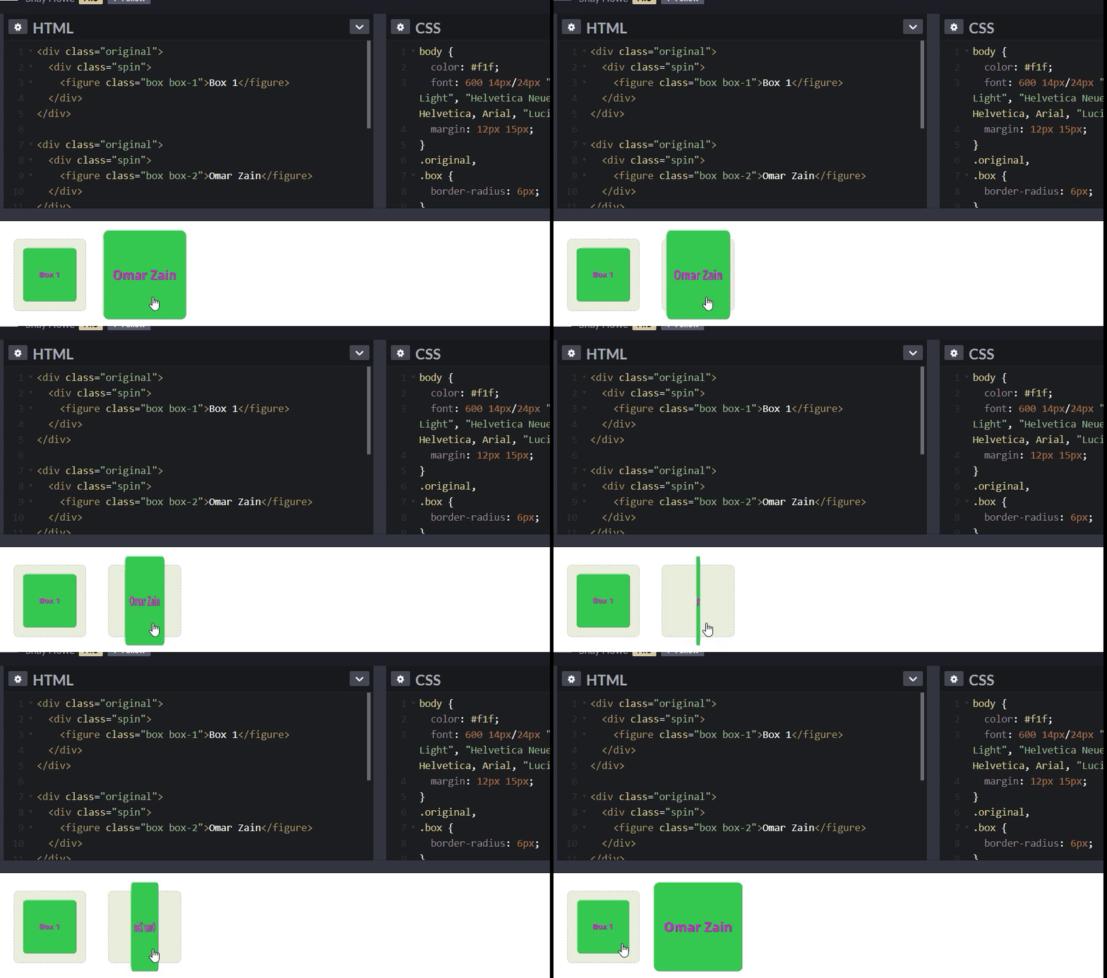
About CSS Transforms & Transitions & Animations:
CSS Transforms
The transform property allows authors to resize, position and change elements; this can be on either the two-dimensional (2D) or three-dimensional (3D) setting. Before getting into the their individual properties and values it is good to know that the general syntax for the transform property is very simple; include the transform property followed by the value and its specific values inside parentheses.
- With CSS3 came new ways to position and alter elements. Now general layout techniques can be revisited with alternative ways to size, position, and change elements. All of these new techniques are made possible by the transform property.
2D Transforms
- 2D Rotate: Provides the ability to rotate an element from 0 to 360 degrees. Positive values will rotate the element clockwise and a negative value will do the opposite.
- 2D Scale: Allows the ability yo resize an element. Any value less than one, will reduce the size of the element, while a value larger than one will increase the element’s size. It is also possible to scale just the width (scaleX) or just the height(scaleY).
- 2D Translate: This manipulates the position of an element on either the y-axis(vertically using translateY) or x-axis (horizontally using translateX)
-
2D Skew: This property is used to distort an element either on the horizontal (skewX) or vertical (skewY) axis or both (skew). The value of this property is set using degrees.
- example
- It is possible to scale only the height or width of an element using the scaleX and scaleY values. The scaleX value will scale the width of an element while the scaleY value will scale the height of an element

3D Transforms
- 3D Rotate: Similar to the 2D rotate with the added rotateZ which allows an element to be rotated around the z axis.
-
3D Scale: Added scaleZ so that three-dimensional transform elements may be scaled on the z axis.
- example

Combining Transforms
- As previously mentioned, the default transform origin is the dead center of an element, both 50% horizontally and 50% vertically. To change this default origin position the transform-origin property may be used.
Transform Style Transform-style
- On occasion three-dimensional transforms will be applied on an element that is nested within a parent element which is also being transformed.
CSS3 TRANSITIONS
- Just a couple of lines of code will give you an awesome transition effect that will excite your users, increase engagement and ultimately, when used well, increase your conversions.
- Fade in
- Change color
- Grow & Shrink
- Rotate elements
- Square to circle
- 3D shadow
- Swing
- Inset border
